Pool Build Update and Choosing a Vinyl Pool Liner Color
- Kiersten
- Jun 20, 2022
- 5 min read
We've jumped over another pool building hurdle - city permitting! They've given us the green light, so that means we are officially-official with our current plans and on the schedule for install sometime later this year. Things are getting real! Though I think with the rain we've had this spring everything is behind so we're not counting on swimming this summer. If we do, that'll be bonus! We shared our initial plans and 3D renderings in our last post here, but while we wait and are very much still in dreaming mode, we thought we'd share another big decision we've made - the color of the vinyl liner! Talk about a hard decision!!
Picking a Pool Liner Brand
Our builder gave us a couple options for companies to look into but knowing how many options there are and how hard of a decision this was going to be, we quickly just decided to focus on one company's liners - Tara Pools. They have a lot of really pretty and unique liners and have a cool visualizer tool on their site to help see the different liners in action. That is really the hardest part, seeing the liner up close or in a swatch is one thing. But seeing it actually in a pool is another. So I especially loved how Tara had organized individual Pinterest and Facebook photo albums showing actual photos of people's pools using the various liners.

Liner Color and Pattern Options
In vinyl pools, the color of the liner is one piece that dictates the overall color of the water and aesthetic of the entire pool area. Liner colors come in so many patterns and hues that range from light aqua to bright blue to modern and moody and everything in between. Even with the same liner, the color looks different pending the amount of clouds or sunlight, the depth of the water, the surrounding environment and time of day. When it came down to time to decide, we were all over the board. Our builder asked us to pick our top three in case of supply issues. The control freak in me both kind of hated that and loved it, figuring it'd be fate on what we ultimately got if there were issues with our first choice. But putting them in order was tough.

Border or No Border?
Most older vinyl pools you see have a decorative border along the water line that is visible above the water. I suppose these provide a more "finished" look but while researching, I was most often drawn to images of pools with clean lines and nothing really that stood out too much. Shocker, right? Most of the pools I like visually seem to be plaster or gunite pools, not vinyl. So I knew I didn't want an ultra fancy border. And if there were borderless options, I'd be into it.

Pattern Strength
Pretty sure "pattern strength" is not the technical way to talk about the pattern of the vinyl, but like I mentioned previously, the pool images I'm drawn to are usually pretty clean overall. So while there are some really cool pools liners out there, and Tara had a lot, I didn't want to get a pattern that would be too busy looking and be the focal point of the pool. Even what I consider to be "busy" would probably end up looking super cool and I could make a case for a lot of them, but we want kind of an understated look overall.

Color Tone
Picking the color was HARD. And while some day we will need to replace the liner after years of wear and tear (hopefully YEARS), this is not something we wanted to regret off the bat. I'll show you our top few choices below (the up-close of the liner with the color as shown on Tara's visualizer (not our house)) - you can see how we were absolutely all over the map!!
From Tara: "The simple elegance and light color palette create a swimming pool that is both soothing and sophisticated." We liked the medium blue tone and the tile appearance of the liner. Would do a no-border option, it's a little too southwestern for us. But the color of the pool is really pretty.
From Tara: "This pattern is as relaxing as a walk along the powdery white beaches of the Gulf Coast. With a soothing blend of blues and cool grays, Fort Walton Beach will create a soft blue water color that’s perfect for enjoying summer." Well that sounds pretty dang good!! Without the border, this one is pretty similar to Cheyenne put puts off a lighter blue hue. The tiles are a little smaller but may blend together a bit more underwater.
From Tara: "Elevate your backyard with the sublime beauty of our new Oasis pattern. Your Oasis pool finish will be a retreat to relax and reenergize. Subtle neutral toned hexagon tiles create a spa-like atmosphere. The understated 4-1/2 in. marble tile border is the perfect complement to this luxurious pattern." The pattern and the liner itself is absolutely stunning. I actually even like the border. Looks like a pretty white marble - both modern and traditional. But the color of the pool itself is really light and not sure it's the vibe we're going for.
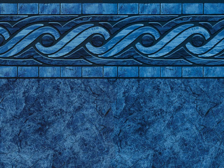
From Tara: "Marble textures and rich blue tiles roll along the top of this inspired design. Hampton creates a graceful setting for your backyard. Imagine floating in calm soothing waters, letting your cares melt away with the irresistible beauty of our Malibu liner pattern." It seems like both Hampton and Malibu use the same marble texture base, with different borders. Borderless, it's just Hampton as the option. We love the deep dark blue of this. The color in full sun is stunning and so inviting, and in clouds it's moody. Gives us more lake vibes than Caribbean vibes and it just seems pretty classic.
From Tara: "This richly detailed pattern will make your pool the envy of the neighborhood. Light gray and blue pebbles make the water a clean arctic blue color. The neutral color palette allows it to complement many types of decking but it works especially well with stone and concrete surroundings." This was a late add to the list. The visuals on Tara's site didn't do it justice but after looking at more examples of people's real pools online, the slightly greenish blueish water color that this blue-grey vinyl put off I really liked. It was different and a little surprising!
From Tara: "Add a new dimension of shimmer to your pool with this spectacular pattern. Enhanced with premium ShimmerTone* inks, Sapphire reflects light to add more sparkle and shine to your pool. Like jewels scattered across the surface of your pool, the chipped stone design of this all over pattern will capture your eye and your imagination." I really love this one, surprisingly. It's pattern is pretty strong and would be a focus. But I LOVE the deep rich color of the water and how it's just a little slightly green. The idea of a little extra sparkle seemed fun, but was going to be an extra expense.
Our Final Pool Liner Pick
Ok that wasn't a few. We did eventually get it down to three to submit with our contract. And no supply issues so we did hear that we got our first choice! Can you guess which one we picked??
Wait for it...
Wait for it...
We chose HAMPTON without the border! Not too busy, but has a little interest. Deep inviting rich dark blue color. Seems like it will jive well with our Midwestern backyard, trees and landscaping. The darker blue gives me more of an elevated backyard pool vibe as compared to the lighter pools that you more often see at public pools, hotels, etc. Plus, a pool liner named Hampton should help the "Hamptons in the Midwest" style I am going for! ;)
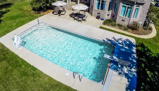
Here's a handful of the no-border Hampton photos that I found on Tara's Facebook page so you can see it in the wild.
If you want to dive deeper, check out more of Hampton on Tara's Pinterest album or Facebook album. Hoping it looks just as good in person!!


